The Problem: Design a logo to capture and reflect myself and my career goals
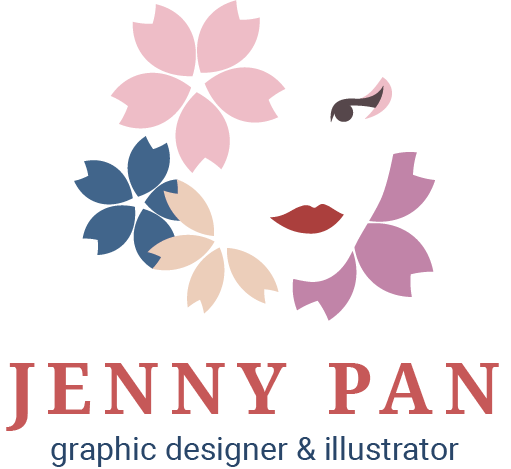
For my personal identity mark, I decided to embrace my Asian culture and heritage through the portrayal of a Japanese geisha. A geisha is a "person of the arts" who is trained in the art of music, singing, and dancing. To become a graphic designer, the "training" process and mentality is similar to that of a geisha. In addition, a geisha does not cease being a geisha once she takes off her makeup at the end of a day. Her role of a geisha is more than that of a profession; it is her way of life.
Throughout the whole design process, I embraced simplicity and cleanliness through the use of negative space. I used colors commonly found in kimono patterns. For the typeface, I picked a serif to contrast the free flowing and rounded shapes of the geisha. The tagline sits below in a complementary sans serif.
Throughout the whole design process, I embraced simplicity and cleanliness through the use of negative space. I used colors commonly found in kimono patterns. For the typeface, I picked a serif to contrast the free flowing and rounded shapes of the geisha. The tagline sits below in a complementary sans serif.
The process
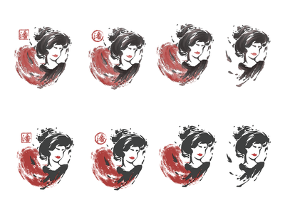
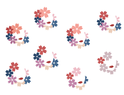
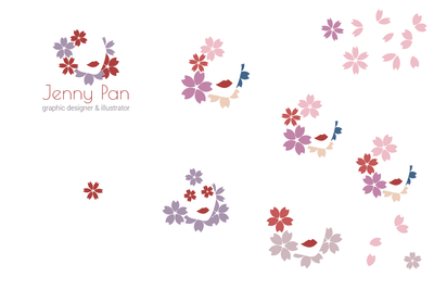
My identity mark has gone through a lot of changes. Initially, I aimed for an illustration approach similar to that of a Chinese brush painting. However, the effect made the logo seem overly oriental and complicated. Even after I decided to go with a simple and clean approach using negative space and cherry blossoms to define the geisha, I struggled with the amount and number of flowers. I wanted to create an open space without losing the definition of her face. Adding an eye really helped to bring out a sense of character and definition.
Site powered by Weebly. Managed by Porkbun


